Today, I have here this beautiful figure of Sena by Griffon Enterprises.
This is her avatar from when they played the Monster Hunter game in the first season (Ep 2).
Yes, what you get here seems to be this "distant" expression that appears on GE's figures. I wouldn't say that it's bad, just more variety would be good. That being said, they must have taken that into consideration with their next
Sena figure. Back to this one, I don't dislike it, and since this is my first GE figure (the second being Ikaros with similar expression), I don't mind the expression.
+-+03.jpg)
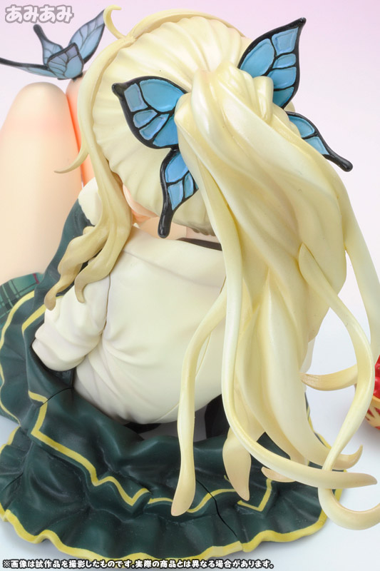
You'll notice that there is a quite a noticeable gap in the hair up close, but trust me, when you look at the figure as a whole, you won't notice this. That being said. attention to the small details really appeals to me. GE took a different approach with the butterfly hair accessory. They gave it a more translucent feel.
Just a slight change in lighting and you can see this effect clearer. How much difference does this make? I didn't notice it at first when looking at the different versions from
Good Smile Company,
Kotobukiya and
Alphamax but after this figure, I can't help but feel the rest to be a bit more plain and somewhat lacking. Here's the Alphamax figure for comparison:
The next part would be her outfit...
The skirt that is mildly affected by the "wind" is very pretty and the shade(s) of purple blend in very well. Her abdomen is very well crafted too. The "armour" (I'm only guessing here, what it's called) on top of her skirt on the hand, don't look like they fit in. It could be the difference in texture, or that the glossy and white when combined together make for a very plastic look.
This is not the case for her shoulder armour though. Here the gloss and brown (?) come together to make a bronze feel.
The rest of a her armour on the arm. When I first looked at this, I thought there was a chip on her arm or maybe there was some QC issue. But when I looked closer at the figure, I realised it was a very faint line as part of the design.
Yes, her panties are purple too.
Nothing much to say about her legs/stockings/boots, nothing amiss here. What you see is what you get. ;-)
The next two parts were the buying factor me, the wings and the weapon...
When it comes to wings, I generally prefer the angel type of wings but I'll make an exception for this. Again, the colour, namely how the purple gradually goes from a darker to lighter shade as it radiates outwards is extremely beautiful. Adding the shine enhances its beauty.
The next factor is Sena's weapon. I don't know if it's just called a sword or there's another name for it.
It is extremely huge and looks awesome. It's hard to say the the sword is detailed to begin with, but GE definitely did a good job here.
However, GE should have included something on the base to hold the sword in position. Very often, just a bump on the table or even sliding on its own, the sword would end up like this. While this is not necessarily a bad position for the sword, I prefer its intended position better.
I'm sure you've already seen the base in the previous pictures. This base is one hell of a big base, especially when compared to the figure itself but I it has to be this big to "house" the equally big sword.
There's a metal plate on the front, I can't read Japanese but I'm guessing it says "Sena Kashiwazaki ~Monster Hunter ver.~"
The base is so huge that Kud and Aoi had to stand on it in order to reduce the amount of space wasted. You would most likely have to do the same if you're short on space.
You can find a few more pictures here

+-+01.jpg)
+-+02.jpg)
+-+03.jpg)
+-+04.jpg)
+-+07.jpg)
+-+06.jpg)
+-+08.jpg)
+-+09.jpg)
+-+11.jpg)
+-+10.jpg)
+-+12.jpg)
+-+13.jpg)
+-+14.jpg)
+-+15.jpg)
+-+16.jpg)
+-+17.jpg)
No comments:
Post a Comment